Transforming customer feedback into a product performance dashboard
Executive Summary
Root combined surveys, app reviews, and interviews to measure product performance.
I was tasked with reimagining a quarterly reporting structure for the executive leadership. I combined internal research, product design, and code to turn that problem into a design system and dashboard prototype.
- Design System Components Created
- +34
- UX Research Workflows Automated
- +40
- Usability Issues Discovered
- +18

Problem
Previous data reports contained useful information, but it was difficult for teams to take action:
- Data VisualizationCharts lacked clearer labels to explain what each metric meant
- Performance TrackingSurvey findings were not consistently communicated or interpreted
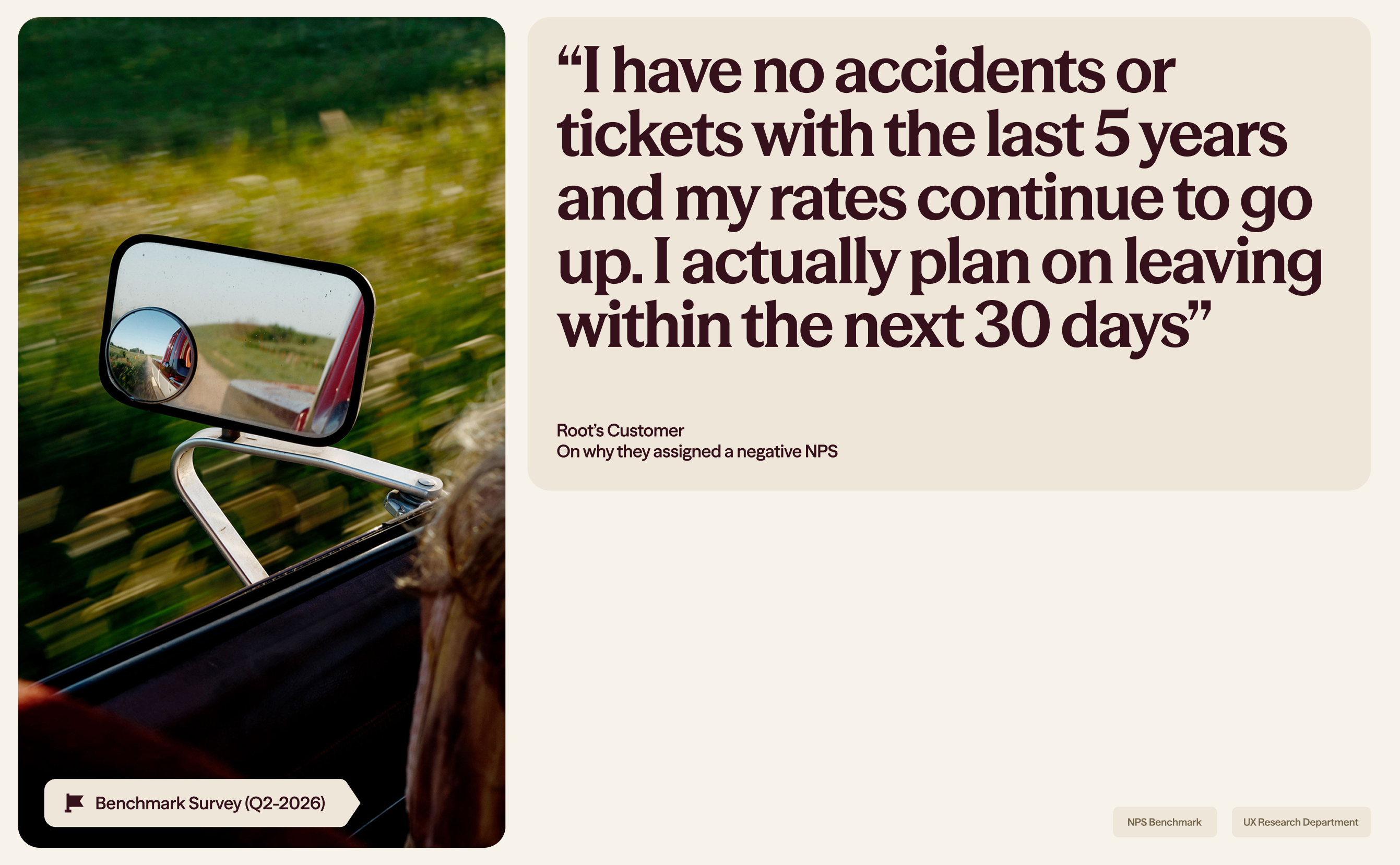
- Customer EmpathyIndividual customers' hardships with insurance were often overlooked
Research
Working closely with the SVP of product, I conducted usability testing interviews across Customer Service, Actuarial, and other business departments.
My objective was to map which customer data mattered most to their daily operations.
I took the initiative to build the design system from scratch, defining variables and layout constraints in Figma. Afterwards, I pivoted into building a working prototype through AI-assisted coding.
Round 1We conducted back-and-forth revision rounds. To validate our deliverable, I asked stakeholders to find information, explain its meaning, and describe how they would use it.
Round 2Finally, to prevent hand-off issues, I built the backend automations for the dashboard to run autonomously, and even created research-specific AI skills for future research projects.
Round 5
Results
My final deliverable contributed to automating user research workflows and increasing our data efficiency. That was achieved primarily through a complete dashboard prototype, with front-end engineering and back-end integrations for executive audiences.
- UX Research Workflows Automated
- +40
- Usability Issues Discovered
- +18


If you’ve come this far,Let’s grab a virtual coffee
For new projects, partnerships, and collaborations, contact me via e-mail.
julio@uni.minerva.eduCredits
- Anna NguyenUX Researcher
- Hala DaherUX Researcher
- Julie HarrisonUX Researcher
- Layilah CampbellUX Researcher
- Jill KelletSVP of Product
- Klew StillProduct Designer
- Brooke WebsterProduct Designer
- Wes KullCreative Director
- Allison ChenProduct Designer
- Jason JeongProduct Designer
- Ryan FarhamPrincipal Product Designer
- Brandon HillProduct Manager
Reflection
Throughout this project, I learned that making customer research easier to apply also meant simplifying its visualization. Given that each department used distinct research methodologies, I wanted to help executive leadership understand the product performance more cohesively and then examine the qualitative evidence behind it.
Building and testing the interface gave me a way to check whether that explanation worked directly in the prototype stage, as I was responsible for both the backend and frontend of the dashboard.

